


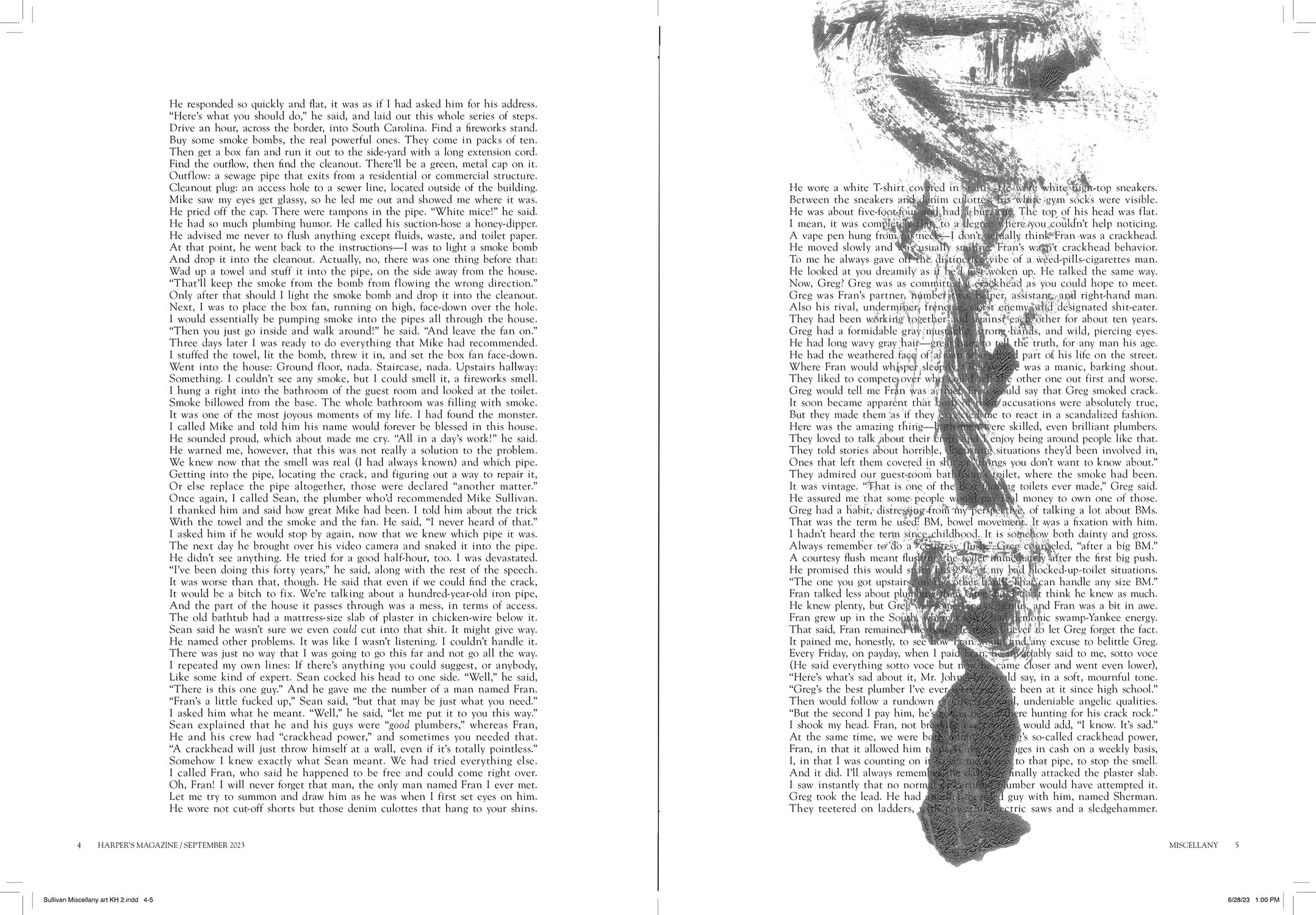


I was asked to create a couple of double-page spreads and an accompanying spot to compliment a wonderfully playful essay written by John Jeremiah Sullivan (the piece is about a crackhead plumber, among other things). My process when approaching commissioned work often changes according to the project. The evolution of these particular images was a collaborative blast!
The Art Director had grabbed a couple of images from my website and dropped them into the working layout for the opening spread. This is always useful for a couple of reasons: 1.) It puts me and the client on the same page (no pun) as far as the spirit of the drawings they’re envisioning for the project, and 2.) The images she chose were drawings I’d made in sketchbooks when nobody was looking – uncommissioned – which is often when we make our most interesting work.
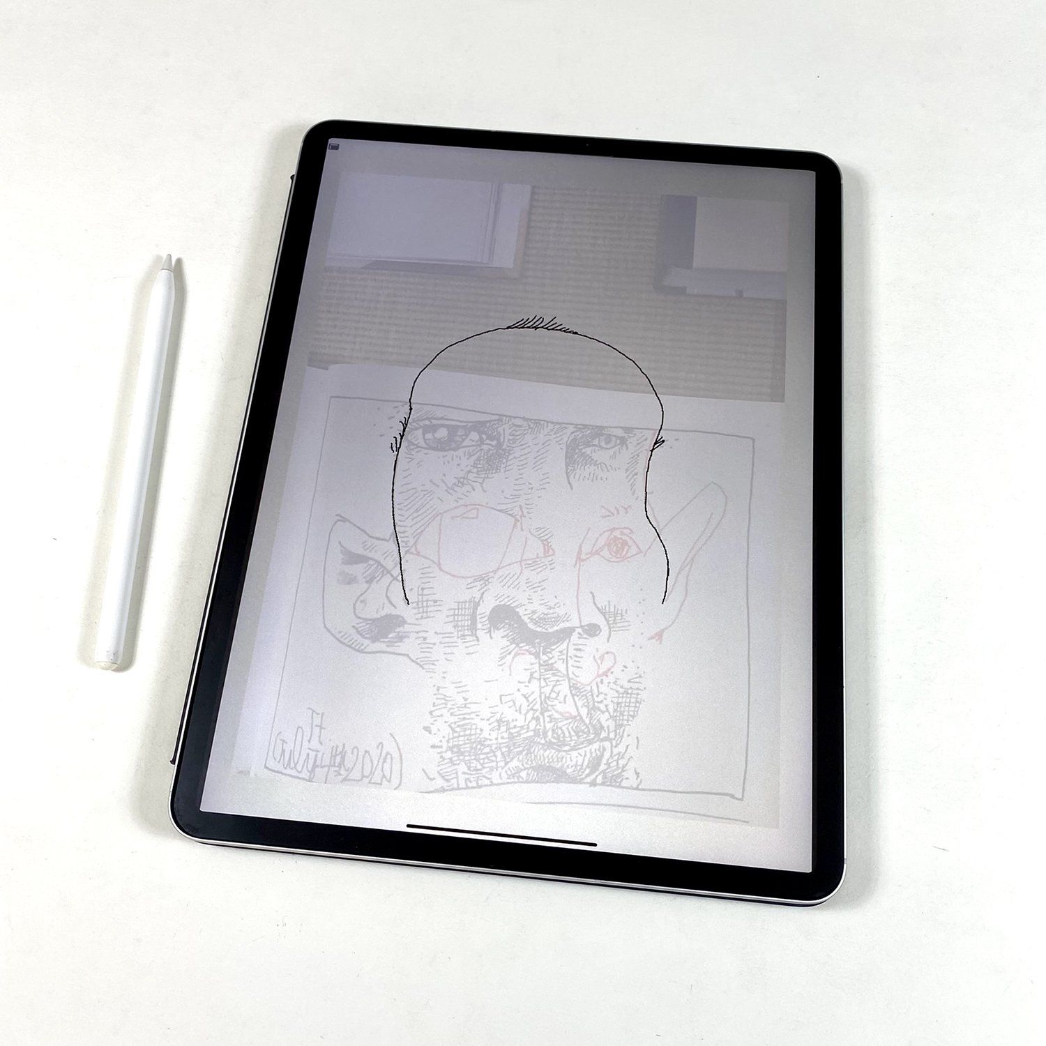
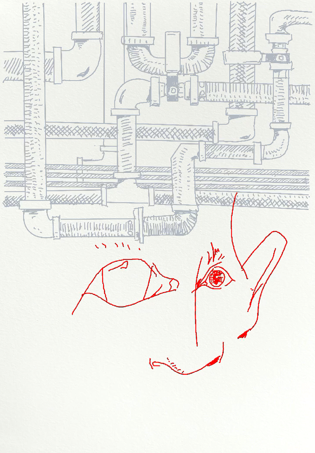
When I’m conjuring a specific character, whether it be for a novel or short story I’ve written or, as in this case, imagining to life somebody else’s creation, I think of it as casting a character for a film or a play. I’d recently been looking back on a series of 101 small drawings I’d made during the first year of the pandemic, late at night before heading to bed, just drawing two or three pseudo self portraits on postcard-sized bits of paper.
One of the postcard faces in particular seemed sort of crack-headish, or on his way, anyway.
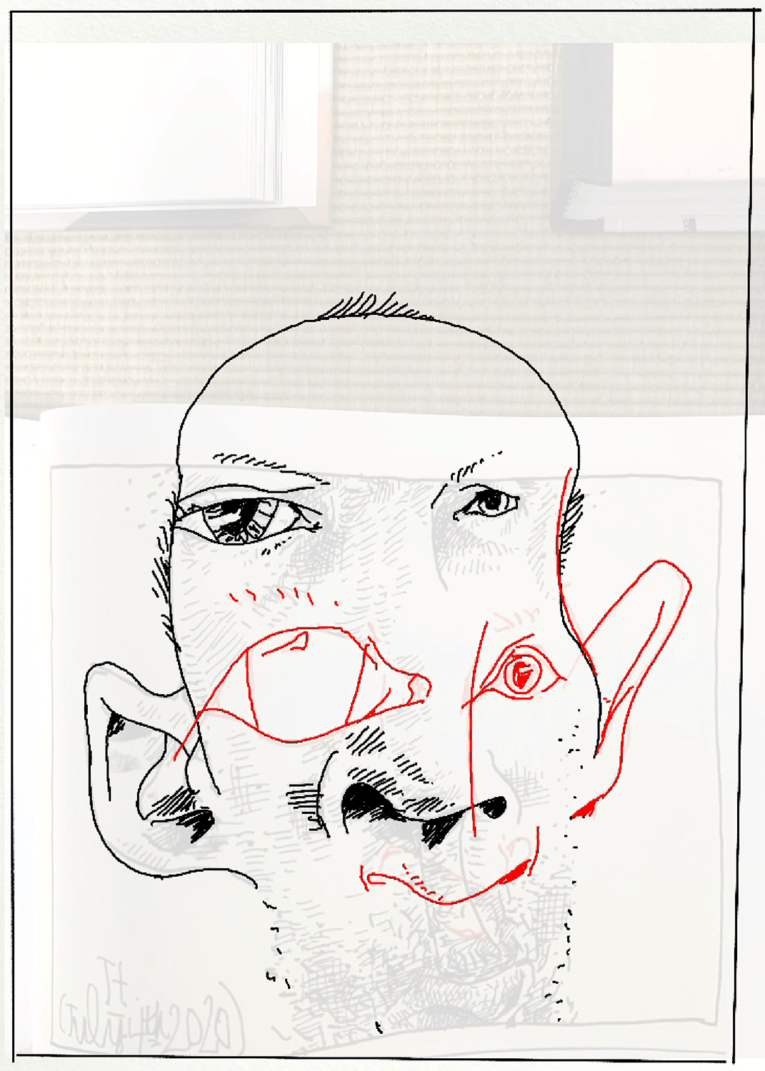
So I photographed him on the rug on the floor of my studio with my iPad and began drawing with my Apple pencil in Procreate, using the postcard pseudo self portrait as a starting point.
I sent the Art Director these first two ideas, conceptual in nature, which she then mocked up as spreads (again, super helpful to see the developing work in context).
And I’d initially considered approaching the second spread more abstractly, playfully referring to images from the text in non-literal ways.
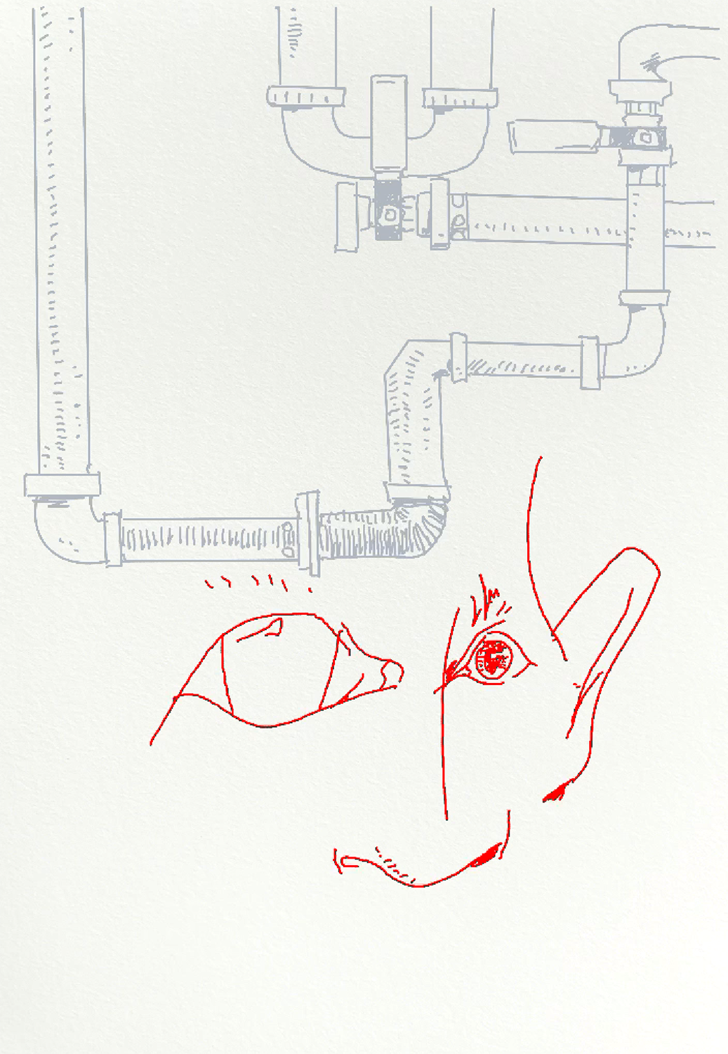
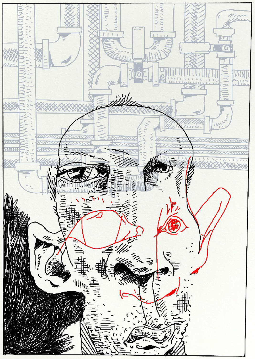
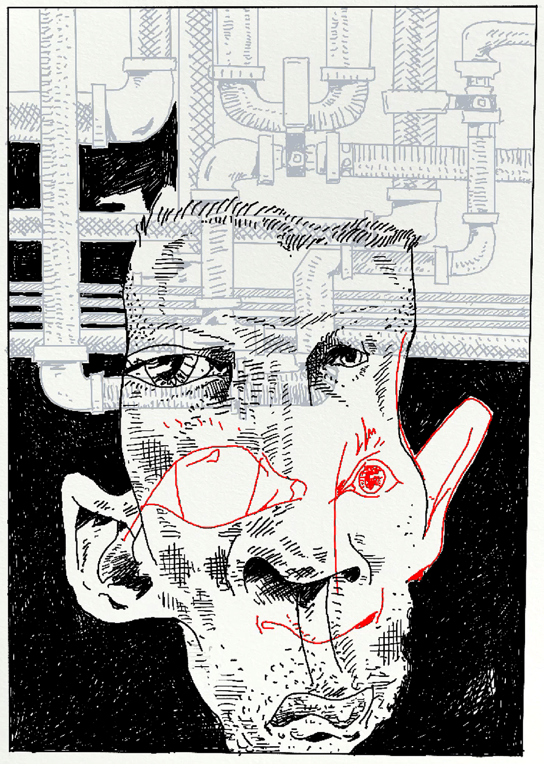
It was decided that the two spreads should be a bit more literal, in support of the essay’s narrative, so I brought the character I’d designed into a kitchen.
And began designing a spread of plumbing pipes (even chaos works best when it’s orchestrated).
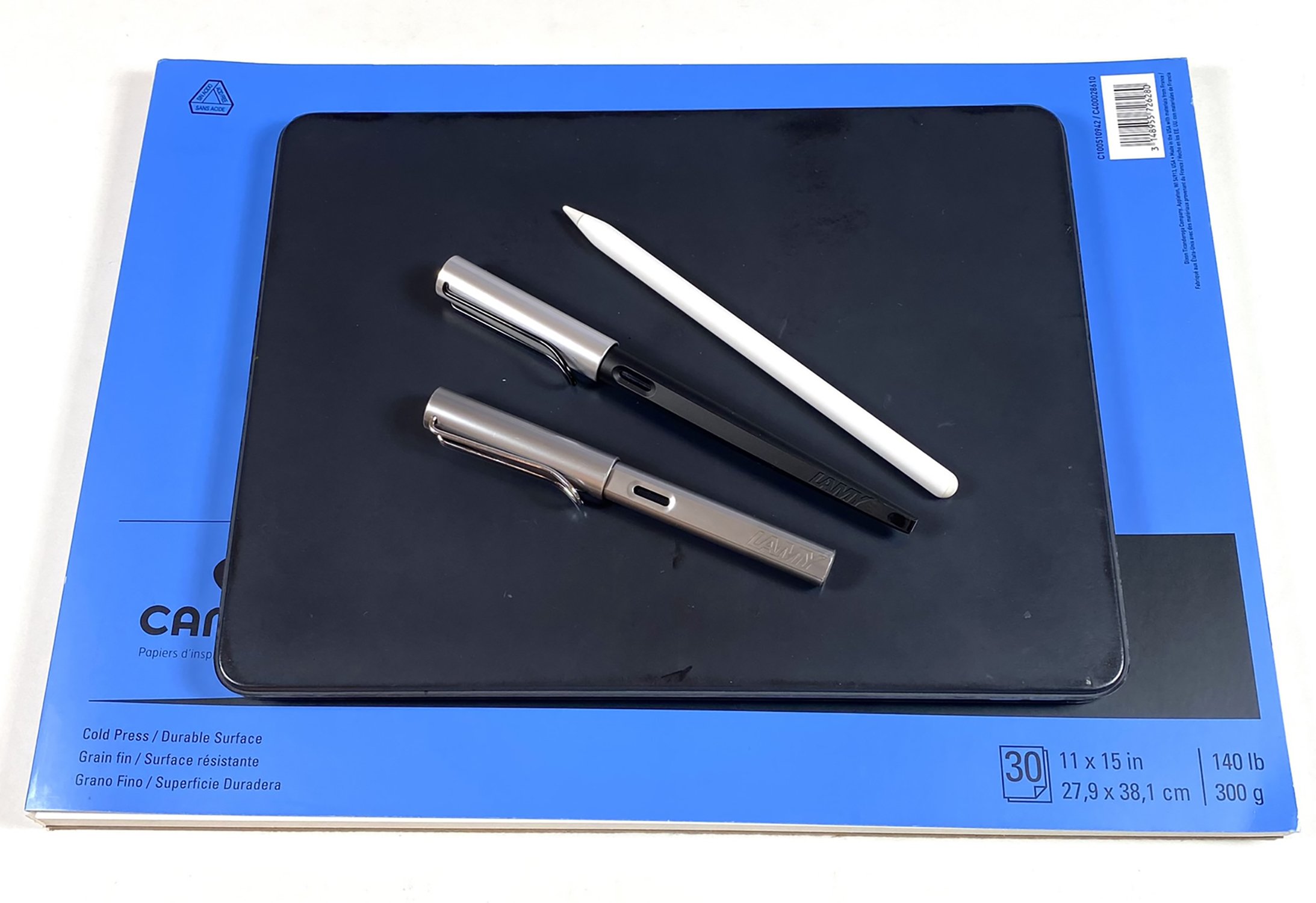
I then printed out these Procreate digital sketches, transferred them to sheets of Canson watercolor paper and inked them with a couple of my Lamy fountain pens (loaded with Platinum brand Carbon Black ink for the first spread, and a thinned Lexington Gray from Noodler’s Ink Company on the second).
The thrill of marrying words to pictures in print never gets old.